A product’s checkout page is one of the most important things for both the user and the product team. It’s important for the user because it’s the page that will instill trust in the product. It’s important for the product team because it’s the last barrier of acquiring those users and all-important revenue.
Without a properly executed checkout process, it can become a difficult or confusing task for the user to complete. This will create frustration and maybe even skepticism about the trustworthiness of the product, causing the user to abandon their purchase or registration. I’m sure many of you have bailed at the checkout screens for similar reasons. I know I have.
Redesigning Akismet’s checkout process was something that had been on my radar since I started work at Automattic over a year ago. It always got pushed to the bottom of the to-do list in favor of other priorities. In the beginning of December we got at least two complaints from customers in a single week. This was the push I needed to address the issues and get a change out the door.
Show me the goods
In case you’d rather just see the before and after, I’ve got you covered. If you want to learn a little about my thought process while working on this redesign, continue reading.
Identifying the problems
The first step with any redesign is examining and analyzing the problems with the current design. Some things to consider are:
- What are the pain points for users?
- Where can ambiguous or confusing copy be clarified?
- What improvements could be made to more easily guide the user through the process?
With these things in mind I outlined some of the current UX problems and how to fix them.
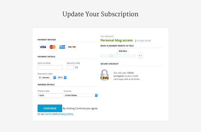
Overall page layout
A lot of customer confusion stems from the two-column layout. Trends in web design, and blogs in particular, have trained users to view a right-hand column as a sidebar. Since the typical content of a sidebar is secondary information about the site, advertisements, etc., we become blind to what’s over there.
However, in the right column of the old design are very important bits of information (e.g. how much money the users will be paying). These things are often skipped over because they are viewed subconsciously as secondary, “sidebar” items.
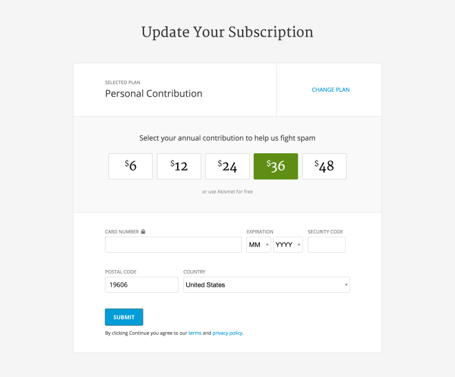
A single column gives a more focused approach to the checkout process for the user. Information is a lot less likely to be seen as secondary and skipped. In fact, increasing the visibility of the contribution amount by providing some contrast helps to call even more attention to the important information.
Form order
The order of the form elements in this case made little sense. Placing the credit card form and submit button before the price selection caused additional confusion. Users put in their information and reach what’s known as the “goal state”. Once a user hits the goal state, they assume they’re finished with the task at hand (paying for their subscription). Their brain switches off and they hit the submit button without ever knowing how much the subscription is going to cost.
This is exaggerated by the two column layout as mentioned above, and is problematic for two reasons.
- The first reason is that users could potentially see us as untrustworthy and dishonest. To them, we are engaging in deceptive practices by, in their eyes, hiding information about how much they are being charged.
- The second reason is in the form of support requests. Our Personal subscription allows users to pay what they want, and we default the payment to $36/year. We get a number of refund requests for $36 because the user didn’t realize we were charging their card. That eats up time the Happiness Engineers could be helping others.
With a one-column layout, the final step of filling in your credit card information and hitting “Submit” has been moved to the bottom of the page where it should be.
“Pay What You Want” Slider
This is an “accessibility nightmare”, to quote one of our users. That little slider is not only highly inconspicuous, but it’s extremely difficult for a user with vision disabilities to operate. In addition to the accessibility issues, it has some UX problems as well. Namely, the price options aren’t apparent until you slide it.
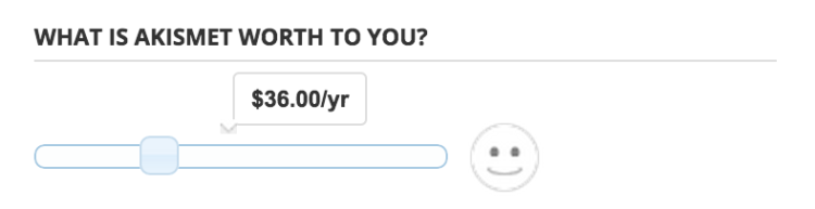
Changing the slider to simple buttons is a more direct approach to selecting your contribution amount, bringing the question of “how much is this going to cost me?” front and center. It also fixes the accessibility issues of the slider.
Considerations for a different pricing mechanism
One thing I had to consider was that by exposing all the dollar amounts, it makes it easier to select the $6 option rather than keeping the slider set at $36. To account for this anticipated loss, I put the free option behind two clicks – one to expose the button, and another click to select the button. The hope is that making the user put more effort into finding the free option will compensate for a potential loss in revenue.
Call-to-action language
Language and copy as design is one of the hardest aspects of product design. As a designer, you need to be able to communicate the proper message to your users to persuade them to use your product.
The message of “What is Akismet worth to you?” is great for current users who are looking to donate, but makes no sense to new users. Potential new users don’t yet know what Akismet is worth to them. This CTA does not effectively motivate them to contribute anything.
What value do we provide to new users?
I asked myself this question while putting myself in their shoes. New users hate spam and is the main reason they’re signing up for an account. They want to make sure we do the best we can to keep spam off their site. Changing the call-to-action message to “Contribute to help fight spam” aligns better with both new and existing users.
Outdated and bloated visual design
This page hadn’t been updated since about 2009, and it showed. Along with the outdated design was some bloated, unnecessary, and even broken elements on the screen.
Modernizing the design brings it more in line with the look of the rest of the site that I’ve been redesigning over the past year. This reduces any disconnect for the user between visiting the updated homepage or plans page and clicking through to enter their billing information. Again, instilling that trust in our product.
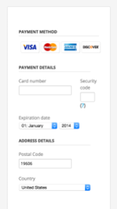
The “payment method” selection was removed and the form overall was trimmed and slimmed. Asking the customer for credit card number, expiration date, and CVV implies the payment method is a credit card and doesn’t need to be explicitly stated.
The form in its current state, broken into multiple sections, looks to the user like we need a lot of information. It’s overwhelming and a daunting task for the user. By condensing and removing some elements (payment method, section headings, the big lock icon, etc.) it puts less cognitive load on the customers’ brains during the checkout process.
Inspired by a post from Brian Lovin, product designer at Buffer, on wishing he had documented personal experience to not only provide value to others but also to himself, I wanted to share some of my thoughts and process on this redesign. I always enjoy reading about the process of other designers. Insight into a redesign is not only fun, but can be very informative.
I have also come to the realization that, yes, I am in fact experienced enough to be able to share knowledge that can help those with less experience. It was always a struggle in my mind accepting that fact, and so with 2015 I hope to write more to help others. I hope this post has provided some value to you, whether it be in the form of learning or simply getting a glimpse of how my brain works.
Amazing post Dan, so glad to see you sharing these thoughts – they’ll be invaluable in the future as you reflect back 🙂
Thanks for the kind words, Brian. Glad you enjoyed the post!