WordPress.com is a website building platform for the masses. Customers needed a place where they could get timely updates, supporting information, and insights to help guide them through their journey during the entire lifecycle of their site. My responsibilities included mapping out UX and journey flows, creating content maps, research, pixel perfect designs, e2e prototyping, and assisting developers with implementation.


WordPress.com is a website building platform for everyone — bloggers, small businesses, even Fortune 500 companies. For years the default logged in page was a feed of blogs and sites you followed. This lacked the value necessary for our customers to thrive and grow their sites.
Without contextual support mechanisms our customers had to seek help through documentation and customer support. The quality of support is high, but customers lacking the skill to find and use it risk leaving unsatisfied. Our vision was to create better ways to serve contextual help and support.

This was a months-long project that kicked off with extensive in-depth interviews with customers and non-customers of all backgrounds. The entire team participated in running research and synthesizing the results.
The biggest key takeaway from this research was that our customers were craving guidance through their entire journey. They looked to us as the experts, and we were falling short of helping them succeed after the initial onboarding phase. Users wanted us to tell them where to focus efforts and what to do next, so they could focus on their content and business.

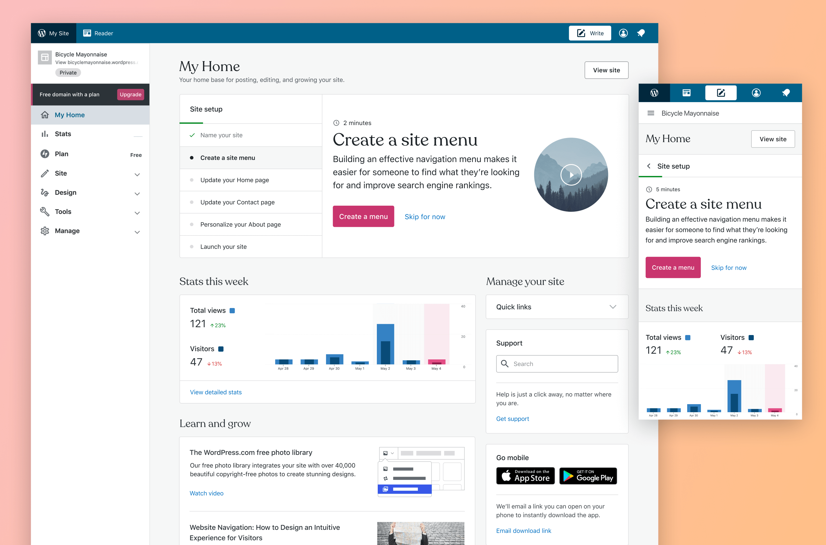
Content framework
After many iterations and feedback, we developed a layout for our content framework. Creating a consistent layout based on types of content ensured customers would always know where to look throughout the entire journey of their site. This was also a key artifact for our engineering team to develop a flexible API that any team or division could plug into for getting their own content in front of users.
Collaborating with researchers, business divisions, and various stakeholders, we leaned heavily on the initial research to develop an experience that served customers’ needs for guidance. We also did plenty of usability testing of prototypes throughout the design process, course correcting where necessary based on learnings.
Data-informed stats design
The stats card went through many design iterations from showing detailed tables and charts to a simple view of numbers. We analyzed heatmaps of how users are interacting with their reports to inform what information is most important to them. An empty state gives tips on growing traffic to keep users motivated.

Outcome
I’m extremely proud of the team for taking on this massive project. In the end we created a full end-to-end experience chock full of guidance to hold the hand of our customers through their journey.
The amount of thought put into the content map and allowed for the creation of a flexible API, helping other teams and divisions to serve helpful content to customers.
The biggest takeaway during this time for me came from our usability testing, iterating, and quick feedback loops. The regular contact with users allowed us to make changes on the fly and showed in the impact we made by increasing our 7-day retention rate 23%.